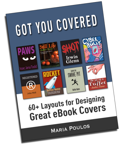
Book Cover Design for Digital Publishing
with 60+ illustrations
[themify_hr color=”light-gray” width=”100%” border_width=”1px” ]
This guide explains page layout design.
Today’s online bookstores need a great looking, inspiring, and “click-able” book cover design to peak curiosity and gain potential sales. In this article, the elements of good layout design are applied to book covers, however the design concepts can be universally applied to most media.
Here is a basic summary of layout design concepts to be used for reference in creating eBook covers — which work well as small thumbnail images. The titles and author names displayed on the layouts are completely made-up. I hit upon current themes, interests and general book categories. The layout names are meant to be fun and easy to remember.
Complete with illustrations, hints on typography, color and placing images and graphics you will benefit from reading this through.
There is much to learn about graphic design. If you read this book you will learn several techniques for page layout design which can be used for creating great layouts.
Who this book is for ….
AUTHORS who want to influence sales
GRAPHIC DESIGNERS who want a quick reference
STUDENTS who want to acquaint themselves to common layouts
ANYONE who needs inspiration for a book cover design
Letter Forms
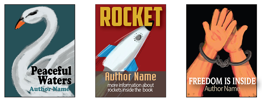
Layouts can take the shape of letter forms. These are easy to design with the right images and text.
Above: “S” layout with the swan. The rocket connects the title and author forming “Z”. The hands and chains form an “A” .
Graphics and type are used to create a letter form.
[themify_hr color=”light-gray” width=”100%” border_width=”1px” ]
Body Parts
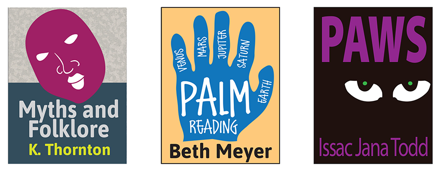
Funny as is may seem, we humans love to look at and compare body parts. Cut-up body parts are attention grabbers. Placement is centralized, shown here on a split cover background and plain colored backgrounds.
Eyes, hands, and faces are incredibly strong images. These transfers well to websites and large format graphics as well. If the graphic is organic — meaning not geometrical — a more playful typeface can be used such as the felt marker font used inside the hand graphic.
Give me a hand, the eyes have it, put on a face.
[themify_hr color=”light-gray” width=”100%” border_width=”1px” ]
Image Dominant
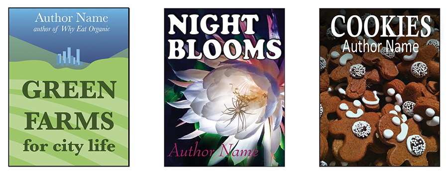
A commonly seen and easy to design, this layout uses a large image with bold text. Use this layout when you have a great image to show off. The image should be simple if the title is long. Note repeating graphics and shapes.
This layout is easy to implement with very little effort — nice image, strong typeface with good contrast off the background. Much like putting a label on a can of peas, the picture on the outside visually explains what’s on the inside.
Big image, bold text; the simplest of concepts.
[themify_hr color=”light-gray” width=”100%” border_width=”1px” ]
Color Blob
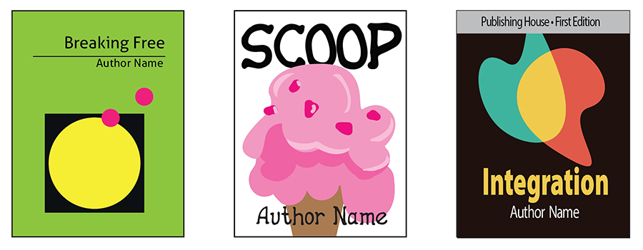
Using color as the main ingredient of a layout creates a striking visual. The graphic can be familiar or abstract — common or conceptual. When the subject is hard to illustrate use this layout with any colorful, but simple, art.
Color creates a mood; so if the book contains a happy little tale, create a bright and cheerful color palette.
The primary element is color, shape is secondary, text places third.
[themify_hr color=”light-gray” width=”100%” border_width=”1px” ]
Little People
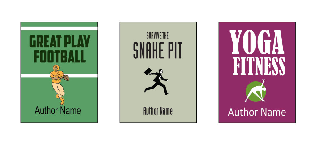
Small silhouettes of the human form are very appealing. We are naturally drawn to the human form. The figures are centralized with space on either side and at the top and bottom. Leaving space will highlight the small figure. The title text should be sized to fill half the page to emphasize the smallness of the figure. The author text is placed on one line at the bottom of the page.
Little people in action are effective even if simple stick figures are used, though professionally drawn figures that relate specifically to the subject of your particular book would make sense, and, become memorable.
Using people graphics — not matter how small — communicates well.
[themify_hr color=”light-gray” width=”100%” border_width=”1px” ]
Background Pattern
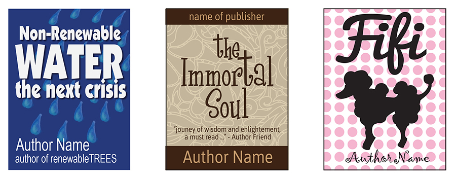
A pattern background can be subtle or bold. The text and graphics are placed on top of the pattern. This is very effective when used with the right combination of graphics and type.
To help the type pop off the page, a drop shadow can be used. If the pattern is subtle enough a drop shadow is not needed.
Good contrast between the type and the background will help develop a more successful layout. A long title requires a more subtle pattern — as shown in the center layout above.
Patterns work best with short titles.
[themify_hr color=”light-gray” width=”100%” border_width=”1px” ]
Big Central Image
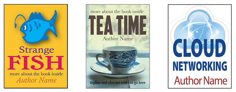
A nice big iconic image that reduces well to thumbnail size is certainly easy to understand. The image is centered — type placed at top or bottom in a text-image, or image-text pattern. Very basic.
Balance the proportions of the image and the type. Here the weight of the type carries the approximate weight of the image in all three layouts above.
The human eye will recognize a graphic faster than the written word. We are naturally drawn to topics of interest use an image that appeals to your audience as well as describes the content of the book.
Iconic images with descriptive text.
[themify_hr color=”light-gray” width=”100%” border_width=”1px” ]
Oblique
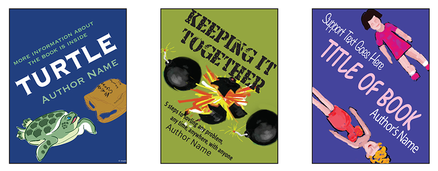
A new angle on a simple layout. Build the layout straight then tilt and place. Note the layout patterns used above: text-image, text-image-text, and image-text-image respectively.
The middle example contains a repeating image and at right, we see a 4-point layout (described later in the book). Small crowded type can work with a strong image — note that small text will not read well on a thumbnail.
Combination layouts at work.
[themify_hr color=”light-gray” width=”100%” border_width=”1px” ]
Four Point
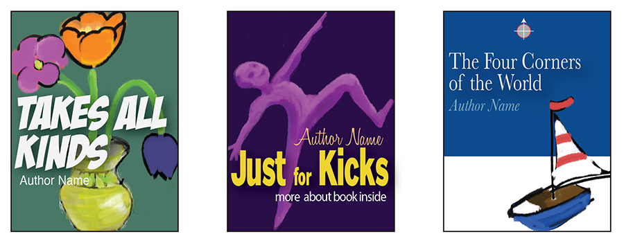
A graphic element touches each side of the frame; top, bottom, left, right. Illustration and type in any combination complete the 4-point layout.
The cover at the right has the boat touching two sides, a compass at top, and type touching the left side of the frame.
Touch-point on all sides.
[themify_hr color=”light-gray” width=”100%” border_width=”1px” ]
Cris-Cross
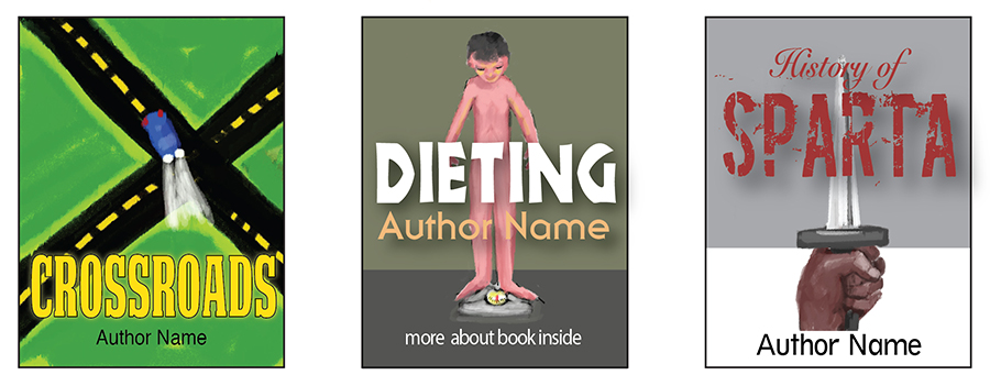
The image itself can dominate the layout in a cris-cross pattern — as in the street graphic at left. In the right two layouts the text crosses the image to form a cross. Best used with narrow graphics.
“X” marks the spot.
[themify_hr color=”light-gray” width=”100%” border_width=”1px” ]
Text Dominant
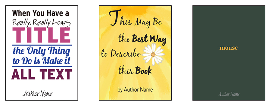
For long titles this may be the best choice. Images or simple graphical elements, such as lines or bars will help hold the type together as a unit. Carefully select a typeface and limit the number of fonts.
The layout at left uses an alternating sans-serif, serif pattern. The center layout uses at star-burst background pattern and applies a four-point design. The layout at right, though the type is minuscule, is still considered text dominate.
Use only words.
[themify_hr color=”light-gray” width=”100%” border_width=”1px” ]
Repeating Shapes
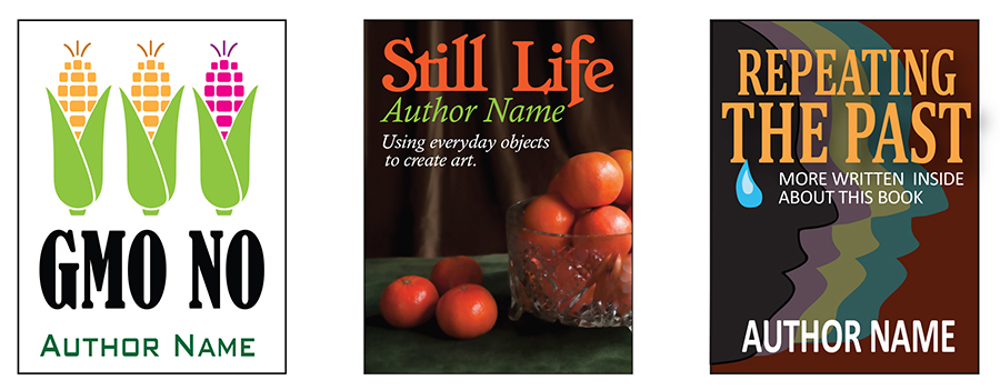
When all else fails, the repeating image is a sure success. Shown above, a line of repeating graphics with a color change, a haphazard pattern of tangerines, and overlapping profiles are examples of a repeating shape.
The graphic should not overpower the title of the book. The thumbnails size of an eBook cover is small on a typical web page. The font size should be large and strong and not get lost as the layout scales down to a small size. Small title fonts don’t work well with a busy pattern. If using a two line title, try scaling the text to fit the full width of the cover.
Say it again.
[themify_hr color=”light-gray” width=”100%” border_width=”1px” ]
Split
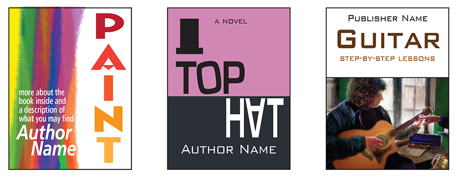
The surface of the layout is pretty much split in two. Split proportions will vary, half page, third page, etc.. Type is used opposite the image or in some sort of mix. The left layout uses a double split, first the image and title text form one split, then the layout is split again with the white copy covering half the image at left.
The center layout uses a letter-form in the overall design — a backwards “Z” competed by the distinct diagonal created by the graphic styled text. The title and author complete the layout.
The split is commonly used.
[themify_hr color=”light-gray” width=”100%” border_width=”1px” ]
Half Face
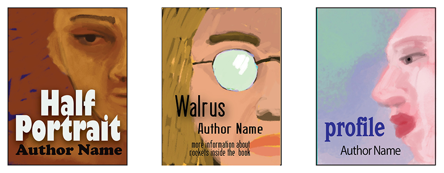
A portion of the face can be used on a layout in many ways, straight on, close-up, and angled high or low. The layout with a covered feature – such as the eyeglasses above is effective. The brain wants to fill in the detail and the eye is drawn to the incompleteness of a face image.
Text is used in juxtaposition to the missing facial features.
[themify_hr color=”light-gray” width=”100%” border_width=”1px” ]
Big Face — Famous People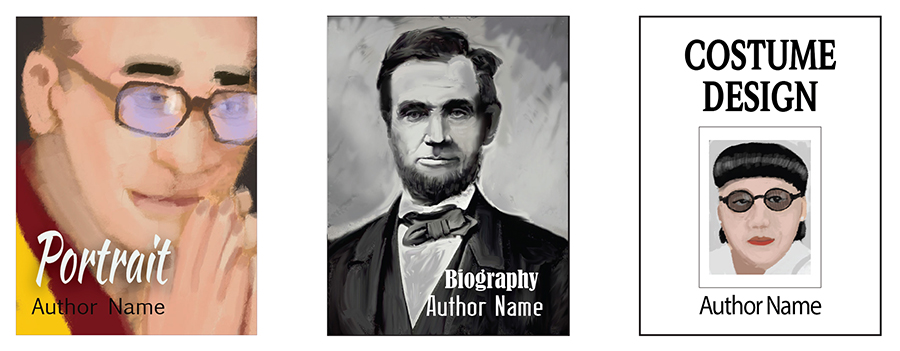
A quick something about a biography cover. It’s not necessary to use a portrait, but here’s a simple portrait cover formula: the more famous the face, the less important the type. If the subject is not well known then the type should take a front seat.
Biographies need not use a portrait – but usually does.
[themify_hr color=”light-gray” width=”100%” border_width=”1px” ]
Lost Space
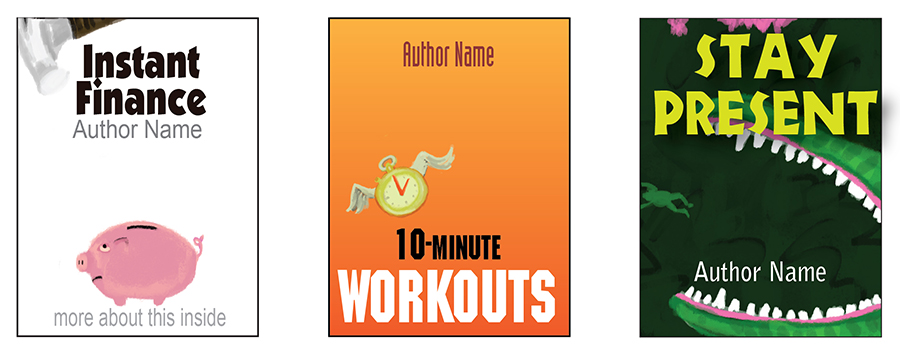
Use space as an element in the layout. The above layouts have action going on in the empty space; the piggy bank is about to be hit by the hammer, the clock is flying, the croc is about to bear down on the tiny frog. Subtle action in empty space pulls the elements together.
The middle layout — though it’s an object — conforms to the Little People layout as well as the Icon and Glyph (later in book).
Empty space has energy.
[themify_hr color=”light-gray” width=”100%” border_width=”1px” ]
Free Form
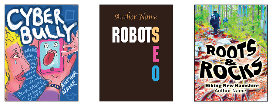
There’s always room for the off-beat, haphazard, and unseemly out of balance layout. They can apply — or not apply — other types of layout concepts. The designs often use hand lettering, unique illustration and interesting color palettes. The layouts are unusual and ultimately captivating.
Rules are just guides, go ahead and be a non-conformists.
[themify_hr color=”light-gray” width=”100%” border_width=”1px” ]
Leave Me Hanging
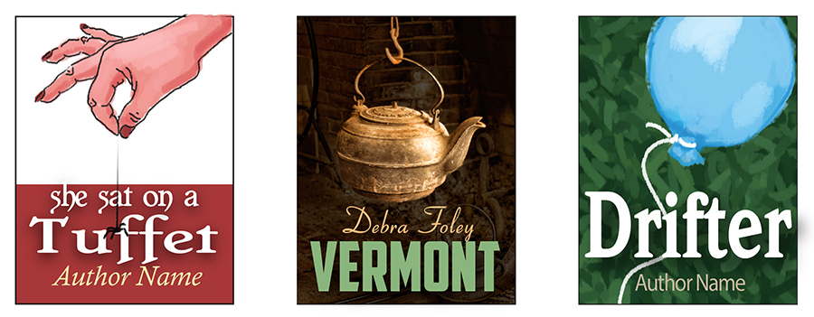
The design elements are used to drop into — or out of — the layout. Simple backgrounds will work best with this approach, but with a little finesse play around with a split cover or patterned background.
The hanging graphic should have an easily recognizable silhouette — or shape — to reduce well. The title and author type is strong — with good contrast — to separate from the background. Titles are used with a drop shadow to help visually lift them off the back plain.
The graphic enters — or exits — the layout.
[themify_hr color=”light-gray” width=”100%” border_width=”1px” ]
Icons and Glyphs
![]()
The simplest and fastest way to produce a book cover with little artistic know-how is to use a glyph. Sometimes found right on your keyboard, use special characters, symbols or icons related to the subject. These bold graphics will stand out in a line-up against complicated images.
Keep this concept simple by using a limited color palette — two or three colors (black and white are considered colors) — with a familiar typeface. Relate color to content — as in the red and blue used at left.
A minimalist approach.
[themify_hr color=”light-gray” width=”100%” border_width=”1px” ]
Star Bursts and Targets
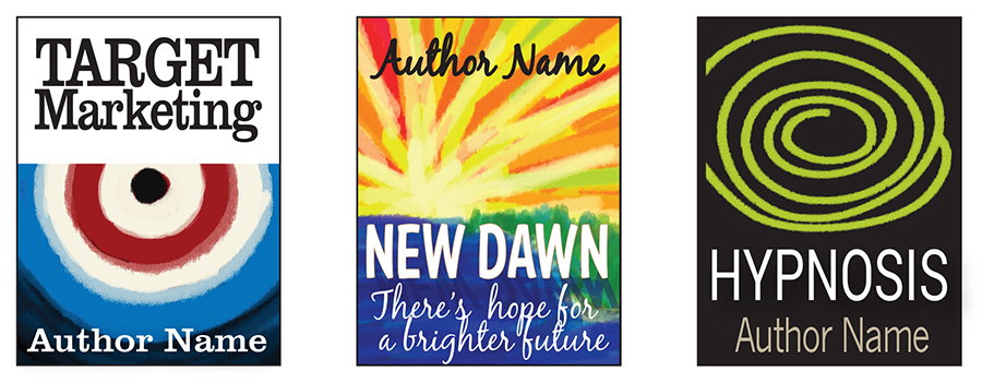
The star burst, targets, and bulls-eyes are common symbols which capture the eye quickly. Spirals belong in this category as well. We humans just can’t resist looking at these symbols. A sunset (or sunrise) on any layout will add depth, movement and interest.
I can’t go without saying that some graphic designers feel that it’s just not cool to use a star burst or bullseye, at all, anywhere.
Don’t over-think a design, these get noticed.
[themify_hr color=”light-gray” width=”100%” border_width=”1px” ]
Fancy Lettering
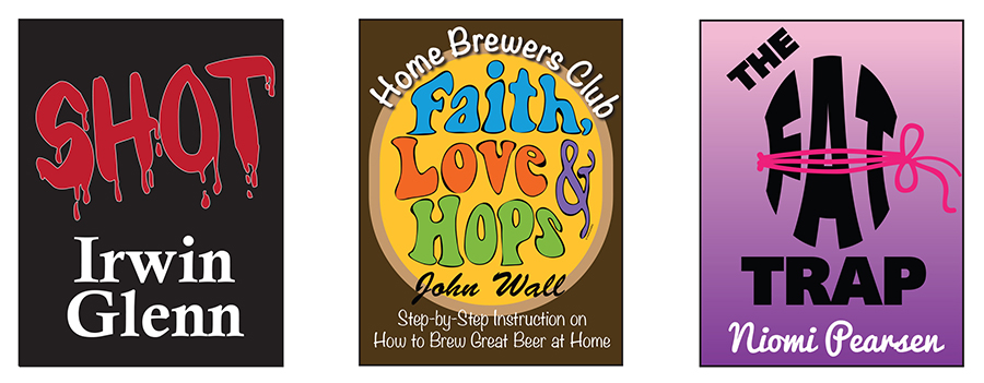
An altered — or interesting — typeface can be used as a graphic. Pick a font that is easy to read at a small size. Consider the audience — children, teens, adults — and which styles will appeal most to that group of readers.
Play around using different typefaces until you see the type transform into a work of art. This layout style can get ugly fast and best left to those who have a little experience using a graphics editor.
It’s important that the type is clean and readable.
[themify_hr color=”light-gray” width=”100%” border_width=”1px” ]
Final Words
We’re living at a great time for publishing. If you have something to say, sell it with a great cover. Take a trip to a book store (on-line or otherwise) and you will recognize many of the layout designs covered in this book. Once understood you will be able to identify and apply these basic principles. Always select an easy to read typeface. A great illustration or photograph can add immensely to the overall the design.
I encourage you to use any of these layouts and switch out the words and graphics to suit your needs. But sometimes we just need to hire a professional book designer. If that’s the case, then by now you have an idea of basic design concepts and know what to look for in a designer.
We are all artists, until we decide we’re not.
More Resources
For information logo design go to:
FlyingCloudDesignShop.com
For information graphic design go to:
www.flyingclouddesign.com
© copyright 2015 Maria Poulos. All rights reserved.
Unauthorized distribution of this book is prohibited.
Written and illustrated by Maria Poulos
